

-
Conference: Marking Language seminar, Drawing Room, London
October 10, 2013Related Exhibitions:
Marking Language, Drawing Room, London
October 10–December 14, 2013Drawing Time, Reading Time, The Drawing Center, New York City
November 15–January 13, 2013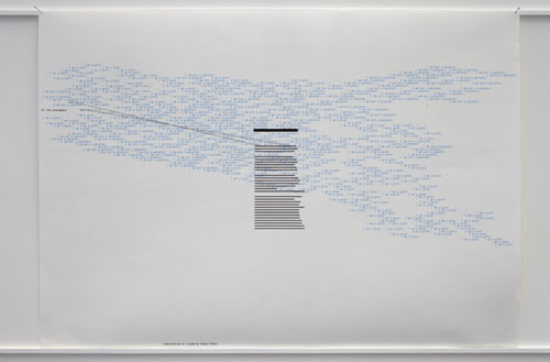
Bernardo Ortiz, Untitled, 2013 (detail); multiple sheets of paper – gouache on paper with fungi, electrostatic print on paper & graphite and ink on paper, hung on balsa wood. Courtesy the artist and CasasRiegner Gallery, Bogotá. Photo: Peter White. The exhibition featured artwork with a tendency toward using typewritten and handwritten language. Accordingly, as the artists drew with words, they emphasized obsolete or nostalgic material technologies in the visual form of the text. The Marking Language seminar featured two hour-long panels, centred on two themes, as well as a poetry reading by artist, poet, and publisher Karl Holmqvist. The first panel featured Colombian artist Bernardo Ortiz, Manchester-based Czech artist Pavel Buchler, and New York-based Lebanese artist Annabel Daou, and was chaired by writer and critic David Markus. With the title: The small movements of language, the power of the ordinary and the pursuit of almost nothing, the first panel began discussions focusing not on written communication, but on drawing. Bernardo Ortiz suggested drawing as something that exists between painting and poetry. This idea was championed by Frank O’Hara, whose poem, Why I Am Not A Painter (1956) served as the impetus behind Ortiz’s artwork in the show. A series of drawings with words, Ortiz constructs a visual translation of the poem using text, graphic lines, and abstract splodges, making an installation of landscape paper to be read/seen in a linear narrative way of viewing. The first drawing will pick up the first lines of O’Hara’s poem, the next a few more words repeated, and so on. Ortiz prints the lines from O’Hara’s poem repeatedly in a small, neat black typeface, and then overlays them with black bars recalling Marcel Broodthaer’s re-working of Mallarme’s famous symbolist poem, Un Coup de Dés. When text creates an image, does its linguistic meaning matter? Pavel Buchler, in response to Ortiz, suggested that drawing exists in the middle of the page, whilst painting reaches its edges.
But what is the relevance of considering language in these ways? What does it offer in thinking about text in art as written communication? The discussants advanced the idea of drawing as “propositional.” We draw to suggest what we might do—a plan, a sketch, a diagram. Drawings draft the future possibility. To Buchler, art is not about any particular medium, but about where it can take the viewer and how it can provoke him or her. Markus linked this to the Kantian idea of “purposiveness without a purpose” and it recalls too J. L. Austin’s idea of “speech acts” and performative utterances, where saying is doing. Considering the translation of language into visual text as art, the exhibition teased out possibilities for the relationship of drawing to writing. Are both propositional?
If we understand “written communication” (curator Kate MacFarlane used this term, and not “text,” “language,” or another descriptor in her introduction) in relation to drawing, this encourages a reflection not on the materiality of language, but on drawing’s communicative potential. All of the words in the exhibition show us letters written or brushed by hand, with the exception of Johanna Calle’s, whose artwork is typewritten, and Ortiz’s. And only Ortiz shows us text rendered with processes of recent technology such as digital text, using the Donald Knuth typesetting system TeX (1978) to layout his texts. TeX is unique because the user programs his or her typesetting digitally, rather than the digital program replicating the manual actions of laying out text (such as cutting, pasting, and dropping in an image). Otherwise, screen-based type, facsimile, Xerox, and other pre-digital and digital processes are visibly absent in the work grouped here.
The panel then turned to question the impact that a written letter has in the present, digital age. (Markus suggested we are already post-digital, but Buchler quickly challenged this point). A written letter evokes an idea of authenticity, as well as nostalgia—something that many of the participating artists were investigating. Buchler reminded us that with traditional correspondence, you are holding in your hand the same piece of paper that the correspondent held—there is a material connection to the letter-writer through the support, the material, on which the text is inscribed. (The “hand” in handwriting suggests tactility, and is synonymous with penmanship, i.e. “it was written in her own hand.”) Buchler, in a nostalgic reference to his own upbringing in Czechoslovakia, recalled his grandmother’s efforts to teach him proper etiquette in letter-writing, during which he was instructed that though one must always reply to a letter, never to do so in under three weeks, in order not to place the other correspondent under undue pressure to reply. Now, Buchler joked, if one receives an email and does not reply within three-quarters of an hour, another will soon follow inquiring about receipt of the first.
Annabel Daou’s artwork was installed on the wall behind the panel, a blackboard painted square with the sentence “I am doing research” written repeatedly in her own hand in white chalk, inscribed over nine hours on the exhibition’s opening day. It is intended as a textual reference/remake of John Baldessari’s 1971 I Am Making Art. Considering the materiality of the support and its relationship to the text, Ortiz suggested “the page” as a useful concept, and an alternative to the material concept of paper, on which drawing has traditionally been inscribed. The page, he suggested, is not tied to the material, although it has material connotations. Indeed, this recalls Mel Bochner’s suggestion that No Thought Exists Without a Sustaining Support (1970), wherein white chalk letters scrawled on blackboard paint on a wall suggest that the support is both language and the material which manifests written language’s physical presence.
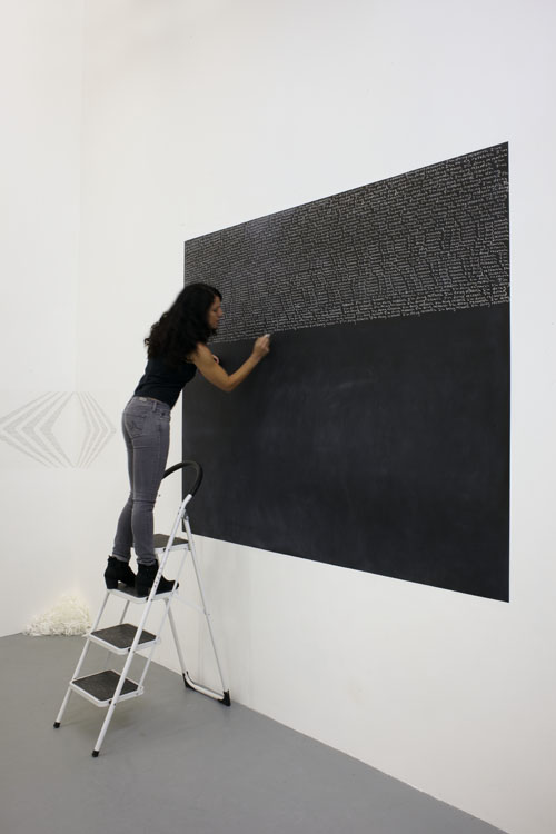
Annabel Daou, I’m doing research, 2013; chalk on blackboard. Drawing Room, 2013. Photo: Peter White. Buchler’s Conversational Drawings stand out because they are the only artworks in the exhibition lacking a linguistic signifier, which leads one to ask, “what language are they marking?” The artworks are a series of simple line drawings on tractor-feed carbonless paper (similar to the paper that would feed Dot Matrix printers). The impressions on the paper—outlines of hands making gestures for shadow puppetry—will one day become invisible as the carbonless paper loses its trace. (It is the type of paper used for credit card purchases before chip and swiping technology became prevalent). The hands’ gestures initially seem to be examples for sign language from a manual, and Buchler indeed did make drawings of sign language gestures in the early 1980s when he moved to England from Czechoslovakia and knew little English. But we cannot see the shadow puppet that these hands could depict, only the instruction for the gesture.
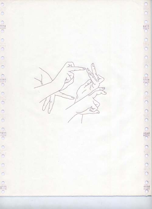
Pavel Büchler, Conversational Drawings 1 (detail), 2007; 14 drawings on tractor-feed carbonless copy paper, 21.5 x 28 cm. Opened to audience questions, the panel was asked about reception and the point of view of their audience. Are these artworks linguistic communication? Are we reading them or seeing them? Buchler rephrased the question from the artist’s point of view: What is it we present when we present a piece of text as visual image? He argued that text is something he decodes, whereas in the process of viewing images, he forgets and does not necessarily account for the text as something he is seeing. Thus, he suggests that images are allowed instead to wash over us, whereas text requires a subjective cognitive action. These questions access ideas dealt with in the foundational Conceptual artworks addressing written language and the subjective decisions an audience makes in the encounter of text as art, namely Smithson’s Heap of Language (1966) and his accompanying text LANGUAGE to be LOOKED at and/or THINGS to be READ (1967). As the South African-born Conceptual artist Ian Wilson wrote in retrospect on Conceptual art in 1994, “The difference between conceptual art and poetry, literature, and philosophy is that conceptual art takes the principles of visual abstraction, founded in the visual arts, and applies them to language.”1 That is, however visually abstracted a word may be, Wilson argues we always see art first, and we read poetry. Though we may alternate between the two cognitive acts at almost imperceptible speed, when we encounter text as art, we encounter visual art, and we are viewers first.
The second panel, with the theme The look of words, the pictures they conjure and the memories they evoke, was greater in potential but quieter in discussion, despite thoughtful chairing by writer and Afterall editor Melissa Gronlund. The title suggests a text as a midpoint in the experience of an idea-as-art, igniting memories of the past, while conjuring ideas in our mind’s eye in the present moment. Even more so than in the preceding panel, the artworks of Colombian artist Johanna Calle and Swedish artist and poet Karl Holmqvist, recall Concrete poetry. Calle works on ledger paper and typewriter to create intricately detailed textual montages of words in the dying languages of the indigenous people of Colombia to describe rain and extreme weather. The words are depicted in a jagged font and letters are filled with smaller typewritten letters. Focusing on ideas of narrative, Gronlund questioned the personal affect of Holmqvist’s writing, and suggested: “We use words to tell a story and that story is about us.” Holmqvist, however, said he was more interested in the ethereal and constant chatter of language in the air—such as the lyrics from popular musicians such as Rihanna and Beyoncé—than he was in his own story. He publishes his poetry in books, performs it, and installs it as wall text—as visual art—in galleries. Gronlund asked if his texts (which are visually laid out in a way that strongly evokes Concrete Poetry in his books) are “performance scores,” an idea art historian Liz Kotz put forward in her 2007 analysis of language in art of the 1960s.2 Holmqvist clarified that his poems and installations are more fluid, existing in different manifestations, but that neither informs the other in a hierarchical way.
Only Buchler’s artworks straddle the New York and the London exhibitions. Drawing Time, Reading Time, which opened in New York on November 15, 2013, focused on the communicative transparency and opacity of text in art that emerged in the nineteen-sixties, as a suggestion of an alternate path to what the curator described as the Conceptual preoccupation with materiality of language.3 In the New York exhibition, an additional gallery space showed the manuscripts of Emily Dickinson as a parallel exhibition. In The Shape of the Signifier, American literary theorist Walter Benn Michaels begins his discussion on the importance of individuality to textuality and the construction of meaning by discussing Dickinson’s manuscripts, in which she often insisted her notations and comments remain.4 Michaels suggests that Dickinson’s blots and dashes are an integral part of the text for the physical immediacy they call up to the author and the reader. These artworks suggest the artists’ desire to communicate, yet a failure to ever do so fully. The attempt itself seems to be what brings artists back to written language as form and subject, again and again.
Kim Dhillon is a writer in London, and preparing a doctoral thesis at the Royal College of Art on text as critical form in contemporary visual art since Conceptualism.
- 1. Ian Wilson, “Conceptual Art,” Conceptual Art: A Critical Anthology, Alexander Alberro and Blake Stimson, eds. (MIT Press: 1999): 414. First printed in Artforum, 22:6 (February 1994): 60-61.
- 2. See Liz Kotz, Words to be Looked At: Language in 1960s Art (MIT Press, 2007).
- 3. Drawing Time, Reading Time, The Drawing Center, press release, October 2013, http://www.drawingcenter.org/en/drawingcenter/5/exhibitions/9/upcoming/500/drawing-time-reading-time/.
- 4. Walter Benn Michaels, The Shape of the Signifier: 1967 to the End of History (Princeton University Press, 2004), 2-4.
-
FILAF: Festival International Du Livre D’Art & Du Film
Perpignan, FranceJune 27—July 1, 2012
FILAF website: www.filaf.com
Before I attended this year’s FILAF festival, it was described to me as “an art historian’s delight.” Having enormously enjoyed the many great books and films presented there, I would add that it is a delight for anyone interested in art—from practitioners of every aspect of art to historians, curators, journalists and anyone with a serious “lay interest.” As this year’s catalogue puts it (in the English language section):
FILAF celebrates the best books and films about art published and released during the year . . . Books and movies about art are objects of specific interest to an art lover: they are vectors of knowledge and emotion that add to the works. More, they are often the first way for us to see works . . . They allow an understanding and appreciation so that without them [the works] would remain purely subjective.
The brainchild of philosopher Sebastien Planas and a group of friends, FILAF is sponsored by the National Institute of the History of Art (INHA) in Paris, as well as other institutions and individuals. It defines “art” very widely, from painting and sculpture to all areas of design and photography. There were so many excellent films to see and talks to attend about the books in competition for the prestigious prizes, as well as “mediateque” talks and round-tables on all sorts of cultural matters, including museums and the arts, and collecting, that it was difficult to choose which event of the two (often three) strands to attend. Above and beyond that was the pleasure of socializing and holding informal discussions with like-minded people, often after the Q & A sessions that followed each talk or screening, or at the many wonderful dinners and lunches that help FILAF achieve its stated aim of providing an atmosphere of discovery and conviviality. This festival revealed southern French / northern Catalonian hospitality at its very best (Perpignan was for many years part of Catalonia).
Using a system of distinguished jurors for each of thirteen subject areas, each year FILAF makes its selections for book winners from several thousand books published around the world, from Brazil and India to the United States, France, and Britain. The criteria are not fixed in stone but include quality of thought and writing. Nearly one thousand books were on open display at the festival and from these the jurors selected the 39 finalists and, ultimately, the thirteen prize winners—one for each category such as Artists’ Books and books on Design, Non-Western Art, Collecting and Collections, Works on Paper, Photography, Film, Architecture, Sculpture, etc. (see below). The thirteen books then all entered the competition for a yet higher level of award; the three top prizes of Prix d’Or (Gold Medal), Prix d’Argent (Silver Medal), and a Special Jury Prize (something akin to a Bronze). Nine films were selected for the festival and, again, three top prizes were awarded.
I found the films particularly stimulating, including that which won the Prix d’Or – Mendelsohn’s Incessant Visions, a beautiful study of the architect Erich Mendelsohn (“the busiest architect in Germany in the interwar years”) by Israeli film maker Duki Dror. The story was told largely through archive drawings, some of which were sent to his wife from the front during World War I, and from her memoirs; indeed the film was as much about her as him. Several of the films showed artists at work, making visual the complex work processes of the individuals concerned, including Gerhard Richter. Film treats shown out of competition included a screening of Catherine Meyburgh’s splendid In Conversation: William Kentridge and Marlene Dumas (2010). There was a special screening of a compilation of extracts from films by the noted French documentary director Adrian Maben, who was honoured with a special award in this his seventieth year, and a screening of his 1989 documentary on Helmut Newton. In addition, by popular request, an additional full screening of a pristine restored print of his Pink Floyd at Pompeii (1972) was added to the end of the program. A brilliant mix of art film, documentary, and music video rolled into one, it confirmed Maben’s early standing as a filmmaker of note.
I highly recommend it. I, for one, will be making every effort to attend in 2013.
Andy Hoogenboom is an artist (printmaker, sculptor, photographer) based in New York. He is currently vice president of the New York Society of Etchers.