

Hans Makart’s Technicolor Dream House: Decoration and Subjectivity in Nineteenth-Century Vienna
September 24, 2015
This article appeared in the Vol. 22 No. 1 / Spring-Summer 2015 issue of West 86th.
The interior of Hans Makart’s Vienna studio has been the subject of widely diverging interpretations. Reconsidering the role of psychological experience in Makart’s decoration, the article examines theories of color, vision, and subjectivity in contemporaneous Viennese writings about both design and physiological optics. The confluence of aesthetic and scientific ideas about color, decoration, and the mind is shown to be important for understanding not only Makart’s studio but also the longer trajectory of Viennese modernity.
The Viennese artist Hans Makart possessed a formidable appetite for decoration. Upon moving in 1871 into a new studio space, a former bronze foundry with a shedlike hall expansive enough to accommodate his enormous paintings, Makart set about laying a sumptuous feast of adornment (fig. 1). Over the next several years, he heaped every surface, like a groaning banquet table, with a bountiful array of exotic fruits: tapestries, carpets, animal skins, paintings, sculptures, furniture, antique curios, and his signature Makartbouquets, vases filled with tall sheaves of grasses, fronds, and feathers.
This rich visual repast, with its sheer volume and variety, became for generations of observers an object of delectation but also disgust. Disagreements about the merits of the studio’s decoration have had to do with more than a simple matter of taste. Indeed, there has been a fundamental divergence of opinion about exactly what the studio was really like. How exactly did the space look and how was it experienced? During Makart’s lifetime, when the studio achieved celebrity-like fame, daily visiting hours offered intimate, firsthand access to an admiring public. According to one report, “every literate tourist had to see it.”1 But following the artist’s death, when the interior was dismantled and its contents auctioned, interpretations of Makart’s studio became subject to the vicissitudes of representation. To later critics and historians, the space has been known through a handful of photographs, engravings, and paintings, as well as an auction catalogue listing its contents and numerous anecdotal descriptions written by visitors. These materials draw attention to different characteristics of the decoration, and from each, distinct ideas of the studio’s character or meaning have emerged.
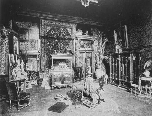
The most widely reproduced and familiar image is a documentary photograph taken in 1875. The photograph (or its engraved copies) appeared frequently in the popular illustrated press and in professional journals and books over the following decades. Brightly illuminated and crisply focused, the black-and-white image draws attention to the quantity, variety, and composition of objects within the space. For later commentators, whose knowledge of the studio derived from the photograph, it was precisely all of the stuff that was most striking and, ultimately, disturbing. The terms used by these authors, like Trödelbude (junk room), Möbel-Magazin (furniture warehouse), or vollgepfroft (jammed full), evoke the studio’s dense materiality and disparage its perceived excess. The turn-of-the-century German critic Alfred Lichtwark, for example, characterized the studio, along with the popular Makartstil of home decoration that it spawned in the 1880s and 1890s, as containing “so many sharp ornaments in the most unlikely places, that the inept visitor returned home with inflamed kneecaps. If you really cared about your children, whom you gave pretty old German names to go with the furniture, you didn’t let them go about unsupervised, or they would come out with scratched hands and sore heads.”2 The excess of physical matter, and the bodily threat it posed, made the studio frighteningly inhospitable. All who enter, beware!
Lichtwark’s emphasis on materiality gone wrong became a default way of understanding Makart’s decoration, as well as a general trope of design criticism that persisted through much of the twentieth century. Authors ranging from the German political economist Werner Sombart in 1900, to the Italian literary critic Mario Praz in the 1940s, to the American curator Edgar Kaufmann Jr. in the 1950s all described Makart’s studio as a space of material profusion, invoking the “clutter of bric-a-brac and junk” and contrasting the messiness and excess with the order and austerity of modernism: Makart versus Mies.3 Even today we perhaps retain something of this tendency, cringing slightly at the sight of all that stuff, and wishing for the hygiene of sunlight and white walls.
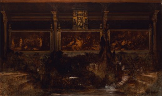
But as inevitable as it might seem today, this polemical characterization of the studio was not the only response. Makart’s contemporaries for the most part took a different view. Their understanding of the space and its decoration can be seen in a second image, an oil painting made by Makart’s friend Eduard Charlemont in 1880 (fig. 2).
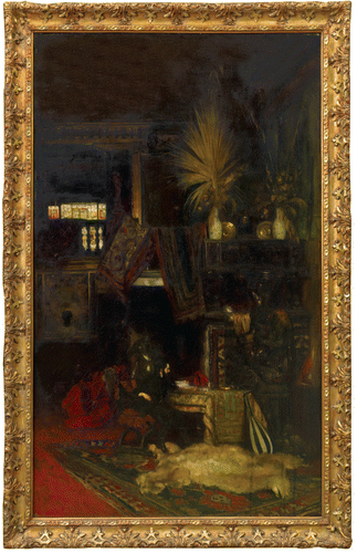
In contrast to the documentary photograph, Charlemont’s painted view hides much of the studio’s material contents by casting the space in deep shadow. What little light does enter the picture is heavily modulated, tinted yellow and red by stained glass, absorbed by thickly piled rugs, and reflected dimly from a few objects in the foreground. Whereas the photograph seems to sharpen our vision of the material contents, revealing even more detail than the naked eye might perceive, the painting offers us instead a murky, heavily mediated view that restricts our ability to make out the particularities of individual objects. Shrouded and obscured, Charlemont’s version of the studio shifts attention away from the collection of things. Instead, the painting emphasizes something immaterial—vision itself, with its inherent limitations and variability. Whereas the photograph seems to represent a stable, objective, physical reality, the painting highlights instead the subjectivity of an imagined viewer, the mental impressions formed by an individual inhabiting and looking around the room. Rather than a space full of stuff, the studio becomes a site of optical experience.
Visitors in the 1870s and early 1880s often described the studio in a way that, like Charlemont’s painting, drew attention to subjective visual perception rather than objective material reality. These visitors spoke less of the decoration itself but rather focused on how they, as observers, responded to the visual experience. In one of the earliest published descriptions of the studio, from 1875, the Viennese critic Karl von Vincenti narrated the experience of a first-time viewer, for whom the initial glimpse triggered emotions of surprise, delight, and wonder:
“A gray-bearded servant guides us through a vestibule…A curtain is raised and…it is as if bandages were removed suddenly from our eyes! How extraordinarily magnificent here, and yet hidden away, like a glimpse into a wonderfully illustrated, fantastic fairytale. We are overcome by a dreamlike, color-drunk silence.”4
Vincenti’s text presents a clear contrast to Lichtwark’s description. Vincenti’s observer engages with the space visually and emotionally, without the physical discomfort described by Lichtwark, but instead with intense pleasure, which is felt immediately at the moment when the curtain or bandages are lifted and visual perception first occurs. Vincenti’s observer becomes excited, even overwhelmed by vision. The experience intoxicates or hypnotizes, inducing muteness and physical incapacity.
The narcotic effect that Vincenti described seems to derive from one visual ingredient in particular: color. His description includes multiple terms and phrases referring to the power of color over the viewer’s body and mind, among them farbenrauschig (color-drunk), Farbenzauber (enchantment of color), and im Bann der Farbensirene (under the spell of the color-Sirens). Color, of course, is what most of all distinguishes Charlemont’s painted view of the studio from the documentary photograph. What we have, then, are two distinct images, the one focusing on physical objects and the other on color and light. The one highlights materiality while the other dissolves it. Likewise, we have in Lichtwark’s and Vincenti’s comments two contrasting ways of describing the studio, the one attacking its material excess, and the other reveling in the power and pleasure of immaterial visual experience. And, finally, we have a historiographical situation in which the former view has prevailed in our own present-day understanding of the studio, while Vincenti’s and Charlemont’s alternate emphases have essentially disappeared. What, we might ask, has become of color, vision, and affectivity in our understanding of Makart’s studio? What of the Farbenrausch? Have Vincenti’s proverbial bandages been placed back over our eyes? The goal of this article is to return to the neglected theme of subjectivity, and to use an investigation of ideas about color, vision, and emotion as a way of reevaluating Makart’s remarkable space.
Although previous literature on the studio has given little attention to ideas about experience and emotion, there are several important starting points for this inquiry.5 In a recent study of nineteenth-century home decoration, Stefan Muthesius has emphasized the centrality of subjective experience in the era’s writings about interiors.6 Muthesius shows that German-language discourse in particular engaged with the theme of subjectivity. German and Austrian decorating books commonly described domestic interiors with terms like Stimmung (mood or atmosphere) and poetisch that refer to emotional effect rather than objective meaning. A second touchstone is the work of Jonathan Crary, who has located the idea of subjectivity in the era’s scientific and philosophical discourses about vision.7 Crary has demonstrated that the nineteenth century saw a shift in the way that vision itself was understood, from an earlier notion of clarity and objectivity to a new idea of the subjective, mediated nature of optical perception. This article, following the leads of Muthesius and Crary, examines period texts from both design theory and natural science in order to situate Makart’s decoration within a cluster of ideas about vision, subjectivity, and the domestic interior.
Ringstrasse Interiors
The urban renovations of Vienna’s Ringstrasse project, beginning with the demolition of the medieval city walls in 1859 and continuing for three decades, not only transformed the city’s infrastructure, civic spaces, and monumental architecture but also remade housing and interiors as well. Carl Schorske and others have noted that the initial phase of Ring construction, from about 1863 to 1873, primarily involved the construction of housing.8 What is less well understood is that as the city’s middle classes moved into large apartment buildings and lavish Mietspaläste, the furnishing of domestic interiors and the consumption of decorative goods became increasingly central to Viennese economic and cultural life. Manufacturers, retailers, artists, consumers, and critics all contributed to the rising status of home decoration. Major producers and merchants, like the glassmaker J. & L. Lobmeyr, the textile manufacturer Philip Haas, and the furniture dealer Sandor Jaray, expanded the business of home furnishings during this period.9 The decorating profession, formerly a humble trade of artisans, grew in scale and prestige. Writing in 1876, the critic Vincenti described how prominent architects like Theophil von Hansen recast themselves during the period as Architekt-Dekoratüre and began supplementing their practices by designing lavish residential interiors for the city’s commercial elite.10
At the center of the new Viennese design economy stood a government institution, the Österreichisches Museum für Kunst und Industrie, founded in 1864 by Rudolf Eitelberger, a professor of art history at the University of Vienna, and Jakob von Falke, a curator and cultural historian who had previously worked at Nuremberg’s Germanisches Nationalmuseum.11 Following the example of London’s South Kensington Museum, Eitelberger and Falke conceived of their institution as a means of increasing the quality and commercial viability of industrially manufactured decorative goods, or Kunstgewerbe, with the goal of enhancing the prestige and prosperity of the Austrian state.12 The museum’s agenda of national-industrial advancement through Kunstgewerbe reform contained in itself little indication of an interest in the interior per se, or in questions of individual subjectivity and the experiential dimension of design. Rather, the museum defined its goals largely around individual objects, their production, and their commercial value measured in terms of material quality and artistic beauty. The initial strategies for collecting and displaying Kunstgewerbe objects at the museum reflected these concerns. Organized by Falke, the collections consisted of historical objects deemed to meet high standards of form and fabrication. In the museum galleries, Falke arranged the objects in groups divided by materials and displayed them in glass cases. As mechanisms of display, the vitrines reinforced the objects’ materiality, enclosing and framing them in a way that separated them from external context, and thus guided visitors to focus on immediate, tangible qualities of form, materials, and manufacture.
Alongside this outward emphasis on materiality, however, an alternative set of concerns with the user and individual experience was already beginning to emerge in the early years of the museum. Discussions of subjectivity appeared in publications by museum-affiliated scholars. Two books stand out. One is Die Physiologie der Farben für die Zwecke der Kunstgewerbe bearbeitet (The Physiology of Colors Adapted for the Uses of the Applied Arts), a work of 1866 that combines natural science with design theory. Its author was Ernst Wilhelm von Brücke, a professor of medicine at the University of Vienna and an active member of the museum’s curatorial board. The second book, written by the curator Falke and published in 1871, is a treatise on home decoration titled Die Kunst im Hause: Geschichtliche und kritisch-ästhetische Studien über die Decoration und Ausstattung der Wohnung (Art in the House: Historical and Critical-Aesthetic Studies on the Decoration and Furnishing of the Dwelling). Together, Brücke’s and Falke’s books established a new theory of emotional effect in the Viennese interior. A comparative reading of their ideas about decoration and its psychological power offers a basis for defining a particular Viennese conception of the interior around 1870 and provides a new way to understand the decoration of Makart’s studio.
Brücke’s Design Theory
The work of Ernst Wilhelm von Brücke, physiologist, professor of medicine at the University of Vienna, and affiliate of the Museum für Kunst und Industrie, presents an exceptional opportunity to consider relationships between science and design in the nineteenth century.13 Over the course of a long and productive career, which stretched from the 1840s to the 1890s, Brücke conducted pioneering research and published influential books on the science of the human body. As an assistant to the Berlin physiologist Johannes Müller in the 1840s, and as a founding member of the Physikalische Gesellschaft in Berlin, Brücke worked throughout his career alongside some of the leading scientists of his generation, including fellow Müller pupil Herman von Helmholtz.14 As a professor of medicine at the University of Vienna from 1849 to 1890, he helped to shape the next generation of Viennese medical science. Most notably, Brücke served as doctoral advisor to Sigmund Freud in the 1870s and exerted a frequently noted influence over Freud’s intellectual development.15
Outside of his scientific research and university career, Brücke was involved with a number of initiatives and discussions related to the arts. The son of a painter, he wrote several books later in his life on topics related to sculpture and painting.16 Earlier in his career, during the period under consideration here, he focused especially on the decorative arts. In 1864, he joined the curatorial board of the Museum für Kunst und Industrie and in that capacity played an important role in shaping the institution’s direction. He formed close professional and personal relationships with the museum’s founders, Eitelberger and Falke.17 Through these connections, Brücke became directly engaged with emerging discourses on Kunstgewerbe and the decoration of the home.
Immediately upon joining the board of the museum, Brücke was encouraged by Eitelberger and Falke to translate his scientific expertise into a theory of design. The result was Die Physiologie der Farben, which he began writing in 1864 and published in 1866.18 In this work, Brücke brought the science of vision to bear on the question of how color is used and experienced in the decorative arts. The book—which to my knowledge has yet to be studied by historians—presents an intriguingly unconventional theory of design that stressed a nonobjective, aesthetic dimension at a time when the wider Kunstgewerbe discourse was dominated by issues of manufacturing and material quality as well as historical styles and their associated cultural meanings.19 Leaving issues of materiality and style aside, Brücke instead focused on the physiology and psychology of perception and the ways that color triggers emotion in the mind of the observer.
Brücke introduced the book with a basic proposition, one that echoed the ideas of his scientific colleagues, such as Helmholtz, about the nature of color.20 He wrote:
Colors are sensations aroused in us by light. These sensations not only vary in intensity, they also vary with respect to quality. We ascribe a color to an object according to the quality of the sensation, caused in us by light, that results from that object. Hence what we describe as colors are on the one hand certain sensations and on the other hand the causes from which these sensations derive. If we have the sensation of red, regardless of whether or not this is caused in us by an external object, then we say: I see red, in other words, I have a sensation like that which is aroused in me by objects that I call red.21
Brücke emphasized here the idea that color is not light itself, that is, not a preexisting, external optical condition; rather, color is sensation, an internal, subjective response on the part of the observer to the visual experience of light. Color does not simply exist on its own; it occurs within the mind of the viewer. Since color is formed internally, the experience or effect—Wirkung or Stimmung—of particular colors or color combinations differs among individuals.22 This lack of consistency meant for the physiologist that color cannot be defined by universal rules. He noted that previous theorists, including the British chemist George Field and the British designer Owen Jones, failed to recognize the subjective nature of color and hence pursued misguided efforts to formulate a set of objectively derived principles, exemplified by Jones’s well-known book The Grammar of Ornament of 1856.23 Brücke argued that color theory should instead seek to explain human visual experience itself, with its inherent variability. By first understanding colors with respect to the subjectivity of vision, artists might better develop an ability to create objects and interiors that are visually and emotionally engaging.
For Brücke, the subjectivity of color vision made color especially relevant to design, which he understood as itself a vehicle for individual emotional experience.24 He framed this argument by drawing a distinction between design and the fine arts. The latter, he argued, seek to represent nature and classical beauty with objective precision. To accomplish their mimetic goal, painters rely not on color but on line, which Brücke claimed can be perceived with clarity and consistency and is subject to universal rules. Color, in contrast, undermines objective representation; color destabilizes form and leaves too much up to the individual perception of the viewer. Color in painting, he argued, must be controlled and even suppressed. Decorative arts, however, bear no responsibility for representation and hence enjoy different possibilities of color usage. Kunstgewerbe, Brücke wrote, “is clearly freer than painting, because the demand for illusion either does not apply at all, or only secondarily.”25 Unlike painters, who select colors to imitate those found in nature, decorative artists can choose more or less without regard for external criteria. Likewise, the viewer of a decorative object experiences colors not by judging them in relationship to nature or classical models, but rather in a freely subjective, purely emotional way.
The aim of design, Brücke suggested, is to manipulate the viewer’s physiological perception in order to create a variety of psychological responses. Much of the book is dedicated to examining how particular decorative choices create optical instability or distortion in which color becomes elusive to the viewer. Individual chapters cover topics like refraction, iridescence, fluorescence, and absorption. Discussion within these chapters focuses on materials that produce dynamic color effects: highly polished metals like gold and silver; galvanized metals like tin, with its dull, irregular reflectivity; precious stones with iridescent properties like opals and pearls; glossy silk textiles like satin, velvet, damask, and brocade; pearlescent oxidized glassware from ancient Rome; industrially produced uranium-oxide glass, or “canary glass,” a fluorescent material that he described as appearing to “radiate a beautiful green light from within”;26 oily liquids and soap bubbles; and peacock feathers with their “metallic-shimmering” quality.27 Such materials share in common a tendency to disrupt color vision by diffusing light. Their minute surface variations transmit light unevenly, causing color to appear to shift and change. The result is to further confound the viewer’s subjective perception, rendering color all the more dynamic and hence, for Brücke, engaging.
Still other chapters of the book address the effects of atmospheric or lighting conditions on color vision. One chapter considers fog, smoke, and water. Another explores candlelight, gaslight, and lamplight. To describe the effect of haziness or dimness on color vision, Brücke coined a term: Merochromie. The prefix “mero” in scientific terminology means “partial.” Merochromy for Brücke described visual experience under optical conditions in which color is filtered and partially obscured. Merochromy, he wrote, occurs with artificial light, whether candle-, gas-, or lamplight, as well as when light is transmitted through curtains or stained glass. Brücke’s merochromy is a mediation and transformation of color by an intervening veil or screen. By filtering color, merochromy dampens overall intensity but at the same time has the effect, he claimed, of drawing out certain tones. Most of all, it enhances the visual experience of the color red, which in a dimly lit interior appears, according to Brücke, more intense, even “fiery.” For Brücke, dampened light and glowing red tones produce a powerful emotional response. He described the psychological effect with the term Stimmung: “Merochromy achieves the important element of Stimmung through which it…captivates our mind; it is, as it were, a polychromatic romanticism.”28 For Brücke, dimness, shimmering, and glow contribute to the engagement of subjectivity, to the activation of the imagination and emotion. These qualities move decoration away from the objective universal experience of the fine arts and toward an individual, psychological experience unique to design.
Falke’s Design Theory
Brücke’s physiological study of color and its effects on the viewer overlaps closely with the decorative theory of his colleague and friend Jakob von Falke. As chief curator and later director of the Museum für Kunst und Industrie, Falke occupied a leading position in Viennese Kunstgewerbe reform. From the early 1860s until his retirement in 1895, he developed exhibitions, gave regular public lectures, and published numerous books and articles, for both popular and professional audiences, on a range of topics related to the decorative arts.29 Die Kunst im Hause, his treatise on home decorating, became his most popular book, appearing in six German editions as well as in Hungarian, Swedish, Norwegian, and English translations.30 Central to the theory presented in Die Kunst im Hause is the role of color, which the author understood as a principal means of creating a visually and emotionally satisfying experience inside the home.
Falke’s book, which includes both an extended history of domestic interiors and a series of chapters on the decoration of modern homes, is unified by an overarching concept of the ideal interior. Falke’s ideal interior incorporated a range of concerns, including family and social life, efficient organization of domestic functions, and physical comfort. But his primary focus lay in the realm of aesthetic questions of visual experience and emotional effect. How, he asked, are the decorative components of the interior, including materials, ornament, light, and color, perceived by an inhabitant? Further, how does the inhabitant feel when encountering decoration?
A well-conceived interior, Falke argued, uses decoration, and especially color, to affect the mind and stimulate emotion. Like the physiologist Brücke, Falke contrasted color with line, arguing that color works intuitively and immediately and is hence the primary formal tool of the decorator. “Color makes the first and strongest impression; it gives the general mood,” he wrote.31 The effects of color might be illusionistic, for example by altering an observer’s sense of spatial dimensions: “A room may be made to look narrower or broader, lower or higher, by means of color.”32 Or color could produce immaterial effects, contributing to a particular mood or character: “If we want to make the room serious or cheerful, bare or rich, simple or splendid; if we want to impart a mood [Stimmung] that is cozy and homey, poetic, warm or cool; if we want to create for ourselves a quiet corner for dreaming, or a spot for solitude and introspective contemplation, or for pleasure and sociability—our first and last medium is color.”33 Falke’s terms, like “dreaming,” “poetic,” and “Stimmung,” refer to a kind of mental experience in which the viewer perceives something that is not necessarily an objective reality. In other words, perception becomes imagination. For Falke, the role of color is to draw the viewer into a fantasy, beyond the objective and the ordinary, in which to find escape and, ultimately, a state of well-being or emotional health. The decorated home, he wrote, should produce, by means of color, an effect of “cheerful repose, in which pleasant tones coalesce into a gentle harmony, what we might describe as a dusky harmony or a warm twilight feeling.”34 Like Brücke’s merochromy, Falke’s “gentle harmony” of color is an aesthetic quality of muted, shimmering tones, which generates Stimmung and stimulates feelings of pleasure and happiness.
By sheltering and supporting the inhabitant, color, according to Falke, played a social role, which he defined in gendered terms, associating color explicitly with women and femininity. “Color is a fairy, an enchantress,” he wrote.35 His metaphor of color as female reinforced already explicit links to emotion and nurturing. But it went still further by supporting a larger argument about the relationship between women and the home. Echoing his era’s prevailing ideology of feminine domesticity, Falke defined the home as a woman’s sphere of activity, separate from the male world of office work and public life. At home, women raise children, support their husbands, and promote beauty by choosing the furniture and attending to personal adornment. Like many of his contemporaries, Falke glossed over the imbalance of power inherent in the separate-spheres model by celebrating the “civilizing” function of domestic work. “Insofar as the woman promotes the beautiful at home, and forms her own taste, that of her family, and her surroundings, the woman contributes to the education of the nation, to the culture of humanity.”36
Falke did not intend to challenge social conventions with his arguments about feminine domesticity, but he did nonetheless hope to address what he perceived as the evolving conditions of modernity, namely the changing nature of urban life. The modern Großstadt, according to Falke, presented a new set of challenges to the happiness of its inhabitants. Offering something like a nascent version of Georg Simmel’s later thesis of metropolitan experience, Falke sketched the outlines of a typical modern subject, a married man of middle-class status with a job that takes place in an office, perhaps in a bank. Falke described this kind of work as mentally absorbing and possibly exhausting. “The way things run today, the husband’s occupation takes him out of the house into the wider world. During the day his mind is absorbed in good and useful ways, with matters of production and acquisition, and even afterward these matters occupy his thoughts.” Though Falke was enthusiastic about “the good and useful” nature of modern business, he acknowledged the mental strain, writing that “the man returns home tired from work and in need of recuperation.”37
To alleviate fatigue, Falke proposed the therapy of decoration, to be provided by the female homemaker. The husband, Falke wrote, “longs for quiet enjoyment, and takes pleasure in the place he calls his own, which his wife has made comfortable and gracious, and has beautified with delightful objects.”38 Interior decoration, in other words, is to serve as a feminine countermeasure to masculine work and work-related exhaustion, to the sort of mental condition that would shortly afterward be diagnosed medically as neurasthenia.39 The ideal home, produced by women through their natural affinity for emotional experience, serves as a counterenvironment to mitigate the pressures of the exterior, male world. The experience of the artistic home is, Falke asserted, essentially different from the kind of mental activity performed by the male subject in the office. Being at home and contemplating decorative objects and spaces stimulates a different set of cognitive faculties: aesthetic rather than economic, intuitive and emotional rather than intellectual, free rather than regulated, and feminine rather than masculine. Color, the key element of emotional decoration, contributes most of all to this experience. Precisely because of the subjective, free, and emotional nature of color vision, as explored by the physiologist Brücke, the colorfully decorated modern home for Falke would offer essential nourishment for the modern male psyche.
Makart’s Technicolor Dream House
By drawing on Brücke’s and Falke’s writings on color, subjectivity, and emotion, we can more fully understand the decorative features of Makart’s studio. For example, the density of objects and the layering of surfaces, features which break up visual continuity and contribute to spatial ambiguity, might be described as creating the kind of dynamic, elusive vision that Brücke emphasized in his physiology of color. As rendered in Charlemont’s painting, Makart’s floors, walls, and ceiling appear to dissolve. The viewer’s perception of surfaces is disrupted by jumbled objects, deep shadows, and the dynamic interaction of light with a variety of materials like polished brass, thick carpets, billowing fabrics, animal furs, and dried plants. The light itself, emitted from a high stained-glass window, does not simply fill the room but rather seems to trickle through the interior, touching certain objects and bringing them to life, while leaving others in darkness. To use Brücke’s term, we might describe the window as a source of merochromatic effect. The stained glass veils and restricts the incoming light but paradoxically enhances the color and visual presence of the illuminated objects. Cool colors are filtered out, while at the other end of the spectrum red and yellow tones become amplified. The resulting warm glow that defines the image is the key ingredient in what Brücke called “polychromatic romanticism” and Falke described as a “warm twilight feeling.” Makart’s decoration creates the kind of color-enhanced Stimmung that was so important to both Brücke and Falke for realizing what they understood as the emotional and even therapeutic potential of decoration.
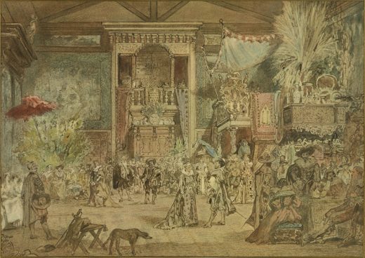
If Makart’s decoration looks like what Brücke and Falke described, what in fact were the artist’s goals? Did the interior for Makart also promise therapy? Or did he have other motivations? He left behind no written explanations. But it is evident that he created the studio with certain audiences in mind and used decoration to shape perception. In fact, Makart used different kinds of staging for different audiences. Most elaborate were a series of costume balls that he held in the studio. For a “Dutch Artists Party” of 1879 he designated a historical theme and designed historical dress for all of his guests (fig. 3).
By immersing his visitors in a visually unified environment of period style and historical narrative, Makart extended his control over their imaginative experience. He also held smaller, less formal and more intimate gatherings of close friends, without costumes, but with decoration and vision again playing a key role. A vivid account of one of these gatherings was published in 1884 by Ludwig Hevesi, the Hungarian-born Viennese journalist and art critic. Hevesi’s narrative describes a dinner party during which Makart discreetly slips away from the group along with a young female guest. The pair then make their way into an adjacent space, a small, windowless room referred to as the “little studio” (fig. 4).
When the other guests eventually go in search of Makart and the woman, they encounter what Hevesi describes as a “curious” scene:
At last we climb a half-hidden staircase in the rear of the atelier. It leads to a little nook upstairs, a sort of boudoir in the sky, a nest of stillness, upholstered in the finest fabrics of the East, into which not a ray of sunlight could enter, but which is filled only with the brooding light of a rose-colored lamp. In this holiest inner sanctum, we find the missing pair. There they sit in silence, across from one another, sunk deep in the cushions, he on the right, she on the left. He has sat her down without speaking a word and then just looked at her, or not even that. She is overcome by the uncanniness of his silent, blazing gaze. He holds her prisoner as if with a sort of magic, in an art-realm of hazy dreams and pulsating nervous sensations. Under the weight of the silence, a hashish or opium mood has overtaken her, a state of being without thinking.40
Hevesi drew attention in this description to familiar decorative features, notably the dim, reddish light and plentiful textiles, while adding an Orientalizing ambience of the opium den or harem. Like Falke, he emphasized the ability of the decorator to use these elements to produce an immersive, emotional experience in which fantasy overcomes reason. Hevesi, however, reversed Falke’s gender positions. In place of the female homemaker and her work-weary husband, now there is a male decorator, Makart, who has created an aesthetic environment to be experienced by a female guest. Hevesi also amplified the power exerted by the decorator over the viewer. The “magical” ability of Makart to control the mind and body of his female guest is greater than any agency that Falke granted to the housewife over her husband. Makart’s decoration does not simply relax, it entrances. Hevesi suggested various analogies: intoxication, hypnosis, religious rapture, or erotic seduction. Whatever the metaphor, the result as Hevesi describes it is complete control, by Makart, the decorator and host, as well as by Hevesi, the voyeuristic observer and author, over the female subject, who may or may not share their pleasure in the experience.
One woman who apparently did appreciate the emotional power of Makart’s decoration was the Austrian empress Elizabeth. In 1882, she commissioned the artist to decorate her bedroom in the Hermesvilla, a private retreat in a hunting preserve outside of the city. Makart died before executing the commission but completed a large oil study, almost eight feet wide, that depicts an elaborately decorated wall with painted woodwork, layers of drapery, carpets, garlands, bouquets, and candelabras (fig. 5).
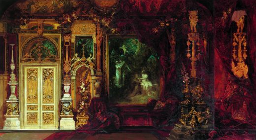
Much like Charlemont’s painting of the studio, Makart’s oil study of the empress’s bedroom emphasizes the dynamic, unstable nature of color vision under partial light. Walls are washed with red and gold. Multiple materials—wood, stucco, textiles—demonstrate varying degrees of reflectivity, absorption, and color saturation. Gauzy layers of fabric create veils that simultaneously mute and enhance color, particularly red. Surfaces seem to dissolve in color. Perceptual instability is heightened still further by a large framed panel in the center of the wall depicting a scene from Shakespeare’s A Midsummer Night’s Dream, set in a forest under aquamarine moonlight. Alongside the image appear three openings in the wall, each of which reveals a glimpse of the same ethereal, greenish night sky, suggesting a continuity between the real space of the room and the imagined literary realm of Shakespeare’s scene. The narrative of dreams and magic, combined with Makart’s trompe l’oeil confusion of spatial boundaries, playfully evokes slippage between reality and fantasy, objectivity and subjectivity, materiality and vision.
Color and Commerce
In the empress’s bedroom, as well as in Hevesi’s dinner-party narrative, decoration is equated with privacy, dreams, and eros. It is important to recall, however, that the studio also served a semipublic function as a site of commerce, in which the artist cultivated a clientele for his paintings. Given Makart’s remarkable commercial success, whether by selling his pictures to private buyers, staging sensational solo exhibitions for a wider public, or winning public commissions, we should ask what role the studio played in his ability to profit in the artistic marketplace.41 Can the studio’s decoration also be understood as seducing consumers?
The art historian Jonathan Crary, cited earlier, has emphasized the historical link between the emergence of scientific theories of vision and the development of a new culture of commercial visual entertainment, beginning with technologically innovative devices like panoramas and stereoscopes and eventually leading to cinema. The physiologist Brücke, in his study of color, emphasized such a link between vision and commerce within the realm of design.42 When Brücke distinguished between Kunstgewerbe and the fine arts, he identified oppositions not only between color and line, emotion and intellect, subjectivity and objectivity, but also between what he understood as the purely idealistic goals of painting and sculpture and the commercial impetus of Kunstgewerbe. Painting, he argued, seeks to reveal timeless beauty for its own sake. Kunstgewerbe, on the other hand, needs to attract consumers in order to make money. According to Brücke, Kunstgewerbe is beholden to “luxury and fashion” (Luxus und Mode), that is, to the imperatives of the marketplace. Consumers seek variety; thus designers must always invent new visual effects. Brücke believed that color, with its instability and subjectivity, serves this demand perfectly. Color is ephemeral. It offers unlimited variation and stimulates an infinite multiplicity of sensations. The shimmering, elusive effects of color that Brücke explored in his book can in this sense be understood as tools for turning decorative goods into objects of desire in the marketplace.
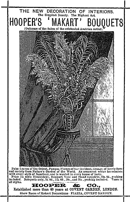
For Makart, decoration aided in multiple ways in attracting potential consumers. The studio provided a visually dramatic stage set on which that artist presented himself, both to individual clients and to the wider public that visited during daily open hours. Moreover, the studio’s decoration could be reproduced and circulated in the marketplace, not only in the form of photographs and other images but also in various derivative consumable manifestations. The popularity of the Makartstil of home decoration grew out of this reproducibility.43 All that was needed to bring the Makartstil home was to purchase a premade Makartbouquet in a shop (fig. 6).
Women could complement their Makartstil interiors by dressing in what was referred to as the Makart-Mode, with feathered berets called Makarthüte and dresses made of heavy velvets in a deep burgundy hue known as Makartrot.44 Thus attired, the female body could shimmer and glow elusively and alluringly like the carpet-draped furniture in Charlemont’s painting of the studio.
Makart himself reproduced the studio’s decorative shimmer in other interiors, some of them with commercial aims. One of these was a temporary gallery space in the Vienna Künstlerhaus that Makart designed in 1873 for a special exhibition of his painting Venice Pays Homage to Caterina Cornaro.45 To display the canvas, Makart draped the walls in black cloth and surrounded the picture with bouquets, animal skins, and gilded antlers in an arrangement that mimicked the studio. The only illumination came from a skylight directly above. For spectators entering at the far end of the long gallery, the picture must have appeared to glow and perhaps even to float in the visually ambiguous space. A similar effect appears in an oil study that Makart made in 1869 showing a decorative installation for his triptych Der Pest in Florenz (The Plague in Florence) (fig. 7).
In this image, the canvases are similarly set in the back of a deep space, surrounded by shadows and a jumble of decorative plants. Especially striking is the way that Makart depicted light and color in the image. The entire space is filled with dim, hazy light, and the painting itself appears washed in Brücke’s merochromatic red glow. In both the 1869 installation study and the 1873 gallery exhibition, objects, light, color, and spatial dissolution intensified the emotional power of the painting on display. The Stimmung of light and color produced an engaging and hence saleable visual experience. For Makart, the same decorative effects that could be used to create leisure and escape for private individuals could also be called upon to draw the attention and stimulate the desire of the consuming public.
Conclusion: Decoration, Psychology, and Viennese Modernity
Understanding Makart’s studio requires looking beyond style to matters of science and commerce, subjectivity and power. By attending to these themes, we not only gain insight into the decorative techniques and social implications of an important work of nineteenth-century design, but we also open up new perspectives on the cultural history of the Ringstrasse era and of Viennese modernity more broadly. Might fin-de-siècle culture be viewed differently if situated in a historical context that includes Makart’s studio and the design theory of Falke and Brücke? Carl Schorske, in his classic study of Viennese modernity, explained what he called the “psychological turn” of Vienna around 1900 as a reaction against the Ringstrasse era. And yet we can recognize affinities among Makart and later figures associated with Viennese psychological culture. For example, there is evident formal congruity between Makart’s studio and Sigmund Freud’s consulting office, with its layered surfaces, diverse objects, dense patterns, soft textiles, and warm colors (fig. 8).
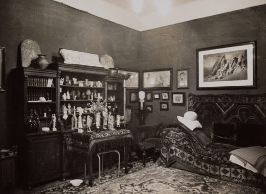
The link has never been investigated by historians, but it seems likely that Freud would have known the studio and even visited it himself. After all, he began his career in 1876 studying under Brücke, who could have introduced the future psychoanalyst to Makart’s decoration and to Brücke’s own ideas as well as those of his friend and colleague Falke about decoration, color, and emotion. Scholarship on Freud’s office has emphasized how decoration contributed to his psychoanalytic practice by creating a visually immersive experience and reinforcing a relationship of power between doctor and patient.46 However, the origins of Freud’s understanding of the interior have yet to be explored, undoubtedly due in part to broader scholarly neglect of the Ringstrasse era. Rather than upholding the idea of a cultural divide between Ringstrasse and fin de siècle we might look instead for continuities and influences, and so discover a longer trajectory of Viennese modernity, as well as develop a fuller understanding of the connections between decoration, subjectivity, and power.
Eric Anderson is an assistant professor in the History of Art and Visual Culture Department at the Rhode Island School of Design. His research explores design practices, discourses, and media, presently with a focus on nineteenth-century Vienna.
- 1. All translations from German are the author’s. “Jeder Fremde, der auf Bildung hielt, musste es sehen.” Alfred Lichtwark, Makartbouquet und Blumenstrauss [1892] (Berlin: Bruno Cassirer, 1905), 13.
- 2. “…soviel scharfe Ornamente an den unwahrscheinlichsten Stellen, dass der uneingeweihte Besuch mit Knochenhautentzündungen nach Hause ging. Wer seine kleinen Kinder, die zu den Möbeln passende schöne altdeutsche Namen erhielten, wirklich lieb hatte, liess sie nicht ohne Aufsicht hinein, denn sie pflegten mit zerschundenen Händen und zerstossenen Köpfen herauszukommen.” Lichtwark, Makartbouquet und Blumenstrauss, 14–15.
- 3. Mario Praz, An Illustrated History of Interior Design [1945], trans. William Weaver (New York: Thames and Hudson, 1982), 370. See also Werner Sombart, Der moderne Kapitalismus (Leipzig: Duncker and Humblot, 1900), 1:300–302; and Edgar Kaufmann Jr., What Is Modern Interior Design? (New York: Museum of Modern Art, 1953), 30.
- 4. “Ein graubärtiger Diener geleitet uns durch einen Vorraum…Der Vorhang lüftet sich und…fällts nicht plötzlich wie eine Binde von unseren Augen? So seltsam prächtig ist’s hier und doch so heimlich, wie ein Blick in ein bildertoll-phantastisch Märchen! Und ein träumerisch, farbenrauschig Schwelgen überkömmt uns.” Karl von Vincenti, Wiener Kunst-Renaissance [1875] (Vienna: Gerold, 1876), 222.
- 5. Most recently, see Ralph Gleis, ed., Makart: Ein Künstler regiert die Stadt (Munich: Prestel, 2011); and Alexander Klee, ed., Makart: Maler der Sinne (Munich: Prestel, 2011).
- 6. Stefan Muthesius, The Poetic Home: Designing the 19th-Century Domestic Interior (New York: Thames and Hudson, 2009).
- 7. Jonathan Crary, Techniques of the Observer: On Vision and Modernity in the Nineteenth Century (Cambridge: MIT Press, 1990).
- 8. Carl Schorske, Fin-de-Siècle Vienna: Politics and Culture (New York: Knopf, 1980), 46–62. See also Karl Weiss, “Die Bauliche Neugestaltung der Stadt,” in Wien, 1848–1888 (Vienna: Carl Konegen, 1888), 1:225–320.
- 9. See Andreas Lehne, Wiener Warenhäuser, 1865–1914 (Vienna: Deuticke, 1990); and Peter Noever, ed., J. & L. Lobmeyr: Between Tradition and Innovation (Munich: Prestel, 2006).
- 10. Vincenti, Wiener Kunst-Renaissance, 57. On Hansen, see Monika Wenzl-Bachmayer, ed., Theophil Hansen: Ein Stararchitekt und seine Wohnbauten an der Wiener Ringstrasse (Vienna: Museum Postsparkasse, 2013).
- 11. On Eitelberger, see Matthew Rampley, The Vienna School of Art History: Empire and the Politics of Scholarship, 1847–1918 (University Park: Pennsylvania State University Press, 2013); on Falke’s early career in Nuremberg, see Eric Anderson, “From Historic Dress to Modern Interiors: The Design Theory of Jakob von Falke,” in Performance, Fashion, and the Modern Interior, ed. F. Fisher, P. Lara-Betancourt, T. Keeble, and B. Martin (Oxford: Berg, 2011), 17–29.
- 12. On the museum’s origins, see Peter Noever, ed., Kunst und Industrie: Die Anfänge des Museums für angewandte Kunst in Wien (Ostfildern-Ruit: G. Hatje, 2000).
- 13. For a biography, see Ernst Theodor von Brücke, Ernst Brücke (Vienna: Springer, 1928).
- 14. See Herbert Hörz, Physiologie und Kultur in der zweiten Hälfte des 19. Jahrhunderts: Briefe an Hermann von Helmholtz (Marburg: Basilisken-Presse, 1994).
- 15. See Elmar Etzersdorfer, “Brücke’s Great-Grandson’s Visit to Freud: A Contribution to the Understanding of Freud’s Relationship to Ernst Brücke,” Psychoanalysis and History 5 (2003): 175–85; Joachim Widde, “Die Erhaltung der Erregungssumme: Die Physiologen Ernst W. Brücke, Sigmund Exner und Ernst Fleischl von Marxow als Lehrer Sigmund Freuds,” Sudhoffs Archiv 83 (1999): 152–70; and George Makari, Revolution in Mind: The Creation of Psychoanalysis (New York: HarperCollins, 2008).
- 16. Ernst Wilhelm von Brücke, Bruchstücke aus der Theorie der bildenden Künste (Leipzig: Brockhaus, 1877); and Ernst Wilhelm von Brücke, Schönheit und Fehler der menschlichen Gestalt (Vienna: Braumüller, 1891).
- 17. See the remarks about Brücke made by Falke in his autobiography, Lebenserinnerungen (Leipzig: Meyer, 1897). See also the extensive personal correspondence between Brücke and Eitelberger held in the archives of the Wienbibliothek im Rathaus, Handschriftensammlung, Nachlass Rudolf Eitelberger von Edelberg.
- 18. Ernst Wilhelm von Brücke, Die Physiologie der Farben für die Zwecke der Kunstgewerbe (Leipzig: Hirzel, 1866).
- 19. On Brücke’s theory of the fine arts and criticism of Makart’s painting, see Alexander Klee, “Genie oder Parvenu: Ernst von Brücke’s Kritik und die Folgen für die Makart-Rezeption,” in Makart: Maler der Sinne, 125–34.
- 20. On the theories of Müller and Helmholtz on vision and color, as well as the important Farbenlehre of Johann Wolfgang von Goethe, see Crary, Techniques of the Observer, 67–97.
- 20. “Die Farben sind Empfindungen, welche in uns vom Lichte hervorgerufen werden. Diese Empfindungen sind unter sich nicht nur an Stärke verschieden, sondern auch in Rücksicht auf ihre Qualität, und je nach der Qualität der Empfindung, welche uns das Licht erregt, das von irgend einem Körper herkommt, schreiben wir ihm diese oder jene Farbe zu. Wir bezeichnen also als Farben einerseits gewisse Empfindungen, andererseits aber auch die Ursachen, von welchen wir diese Empfindungen herleiten. Wenn wir die Empfindung Roth haben, gleichviel ob sie uns durch einen äusseren Gegenstand erregt worden ist oder nicht, so sagen wir: Ich sehe Roth, d. h. ich habe eine Empfindung, wie sie mir von Gegenständen aus erregt wird, welche ich roth nenne.” Brücke, Die Physiologie der Farben, 17.
- 22. Ibid., 7.
- 23. Ibid., 4 and 9.
- 24. Ibid., 3–5.
- 25. “Sie ist eben hier freier als die Malerei, weil die Anforderung der Illusion theils gar nicht, theils erst in zweiter Reihe an sie herantritt.” Ibid., 5.
- 26. “…aus seinem Innern ein herrliches grünes Licht verstreut.” Ibid., 117.
- 27. Ibid., 90.
- 28. “Sie gewinnt damit das wichtige Element der Stimmung, durch das sie, den Verhältnissen angepasst, unseren Sinn gefangen nimmt; sie ist gewissermassen die Romantik in der Polychromie.” Ibid., 254.
- 29. On Falke, see Eva B. Ottillinger, “Jakob von Falke (1825–1897) und die Theorie des Kunstgewerbes,” Wiener Jahrbuch für Kunstgeschichte 42 (1989): 205–23; and Eric Anderson, “Beyond Historicism: Jakob von Falke and the Reform of the Viennese Interior,” PhD diss., Columbia University, 2009.
- 30. Jakob von Falke, Die Kunst im Hause: Geschichtliche und kritisch-ästhetische Studien über die Decoration und Ausstattung der Wohnung (Vienna: C. Gerold’s Sohn, 1871). For a list of the multiple translated versions, and on the book’s relationship to other nineteenth-century writings about interior decorating, see Muthesius, The Poetic Home, 41–50.
- 31. “Die Farbe macht den ersten und auffallendsten Eindruck, sie giebt die allgemeine Stimmung.” Falke, Die Kunst im Hause, 180.
- 32. “Mit der Farbe können wir das Zimmer enger oder weiter, niedriger oder höher erscheinen lassen.” Ibid.
- 33. “Wollen wir das Zimmer ernst oder heiter, nackt oder reich, einfach oder prächtig gestalten, wollen wir ihm eine gemüthlich-anheimelnde, eine poetische, eine kalte oder warme Stimmung verleihen, wollen wir uns einen träumerischen Ruhewinkel schaffen, eine Stätte der Einsamkeit und des beschaulichen Nachdenkens oder eine Stätte des Vergnügens und der Geselligkeit—unser erstes und letztes Mittel wird die Farbe sein.” Ibid.
- 34. “In jedem Falle muß Ruhe herrschen, aber eine heitere Ruhe, bei der angenehme Töne zu einer milden, man möchte sagen, dämmernden Harmonie, zu einer warmen Zwielichtstimmung zusammenfließen.” Ibid., 299.
- 35. “Die Farbe ist eine Fee, eine Zauberin.” Ibid., 180.
- 36. “Die Frau, indem sie das Schöne im Hause fördert und ihren eigenen Geschmack und den ihrer Familie und ihrer Umgebung bildet, arbeitet mit an der Bildung der Nation, an der Cultur der Menschheit.” Ibid., 351.
- 37. “Wie heute der Weltlauf ist, geht der Beruf des Mannes, seine Thätigkeit aus dem Hause hinaus ins Weite, seine Gedanken sind des Tages über—und sie spinnen sich fort—dem Guten und Nützlichen, dem Erschaffen und Erwerben zugewendet, und wenn er heimkehrt, arbeitsmüde und der Erholung bedürftig, so verlangt ihn nach ruhigem Genuß.” Ibid., 348.
- 38. “…ihn erfreut die Stätte, die er sein nennt, und die ihm die Frau behaglich und anmuthig bereitet und mit reizenden Gegenständen verschönert hat.” Ibid.
- 39. See Joyce Henri Robinson, “‘Hi Honey, I’m Home’: Weary (Neurasthenic) Businessmen and the Formulation of a Serenely Modern Aesthetic,” in Not at Home: The Suppression of Domesticity in Modern Art and Architecture, ed. Christopher Reed, 98–112 (New York: Thames and Hudson, 1996).
- 40. “Endlich ersteigt man auch eine halbversteckte Treppe im Hintergrunde des Ateliers. Sie führt zu einer Erkernische empor, eine Art Boudoir in der Luft, einem Nest des Schweigens, ausgepolstert mit den köstlichsten Geweben des Ostens, keinem Sonnenstrahl zugänglich, nur von dem brütenden Rosenschimmer einer Ampel erfüllt. In diesem Allerheiligsten findet man endlich die Verschwundenen. Sie sitzen, tief in Kissen versunken, er rechts, sie links, einander gegenüber und schweigen. Er hat sie dort hingesetzt, ohne ein Wort zu sagen, und hat sie seitdem nur angeschaut, oder auch das nicht. Es ist ihr unheimlich geworden unter seinem stillen, brütenden Blick, der sie mit einer Art Magie in diesem Kunstkreis von vagen Träumereien, von wogenden Nervenstimmungen gefangen hielt. Eine Haschisch-oder Opiumstimmung war auch über sie gekommen unter dem Druck dieses Schweigens, dieses Seins ohne Denken.” Ludwig Hevesi, “Hans Makart” [obituary published September 4, 1884], in Hevesi, Wiener Totentanz: Gelegentliches über verstorbene Künstler und ihresgleichen (Stuttgart: Adolf Bonz, 1899), 163–64.
- 41. On Makart’s commercial success, see Doris H. Lehmann, “Maler und Stratege: Hans Makarts Weg zum Erfolg,” in Gleis, Makart: Ein Künstler regiert die Stadt, 50–57.
- 42. Brücke, Die Physiologie der Farben, 5.
- 43. On the popularity of Makartstil decoration, see Hans Ottomeyer, “Zwischen Kunst und Leben: Die großen Ateliers des Historismus”; and Eva-Maria Orosz, “Der Makartstil: Ein Atelier also Vorbild für das Wiener Interieur,” in Gleis, Makart: Ein Künstler regiert die Stadt, 70–81 and 116–125.
- 44. On Makart-inspired clothing fashions, see Michaela Lindinger, “Die Kinder von Plüsch und Pleureuse: Hans Makart und sein Gefolge,” in Gleis, Makart: Ein Künstler regiert die Stadt, 82–91.
- 45. For an account of the exhibition, see Elke Doppler, “‘Ich male meine Bilder am liebsten mit Rücksicht auf eine architeketonische Umbegung’: Hans Makart als Ausstattungskünstler,” in Hans Makart, Malerfürst (1840–1884), ed. Renata Kassal-Mikula (Vienna: Historisches Museum der Stadt Wien, 2000); and Stephanie Auer, “Caterina Cornaro: ‘Die theuerste gemalte Königen,’” in Klee, Makart: Maler der Sinne, 46–55.
- 46. Diana Fuss and Joel Sanders, “Berggasse 19: Inside Freud’s Office,” in Stud: Architectures of Masculinity, ed. J. Sanders (New York: Princeton Architectural Press, 1996), 112–39. See also Volker M. Welter, Ernst L. Freud, Architect: The Case of the Modern Bourgeois Home (Oxford: Berghahn Books, 2011).
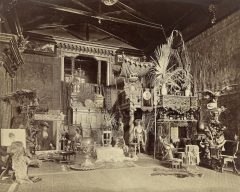
Fig. 1. The “large studio” of Hans Makart, decorated ca. 1871–73; photograph by Atelier Victor Angerer, ca. 1875. Wien Museum, inventory number 97.283.